top of page

The Luxury Designer's Guide: My Favorite Paint Colors


As a luxury interior designer, I'm always inundated with inquiries about paint colors. It seems like everyone wants to know, "What's the paint color here?" every time I reveal a new design. And you know what? I absolutely love it! We don't hold back on paint colors around here. So, in response to overwhelming demand, I'm thrilled to present the latest edition of The Luxury Designer’s Guide, dedicated to my tried and true paint colors—my current favorites, you could say.


When selecting paint colors, it's wise to keep in mind that colors may appear differently in your own space due to variations in lighting, architecture, and surroundings. To mitigate this, be sure to get your paint samples and test them on your walls to see how they look in your specific environment before making your final decision.


So, without further ado, let's dive into my current top picks! For your convenience, here's a handy list of all the colors.


List of Favorites


1. Greyhound by Benjamin Moore

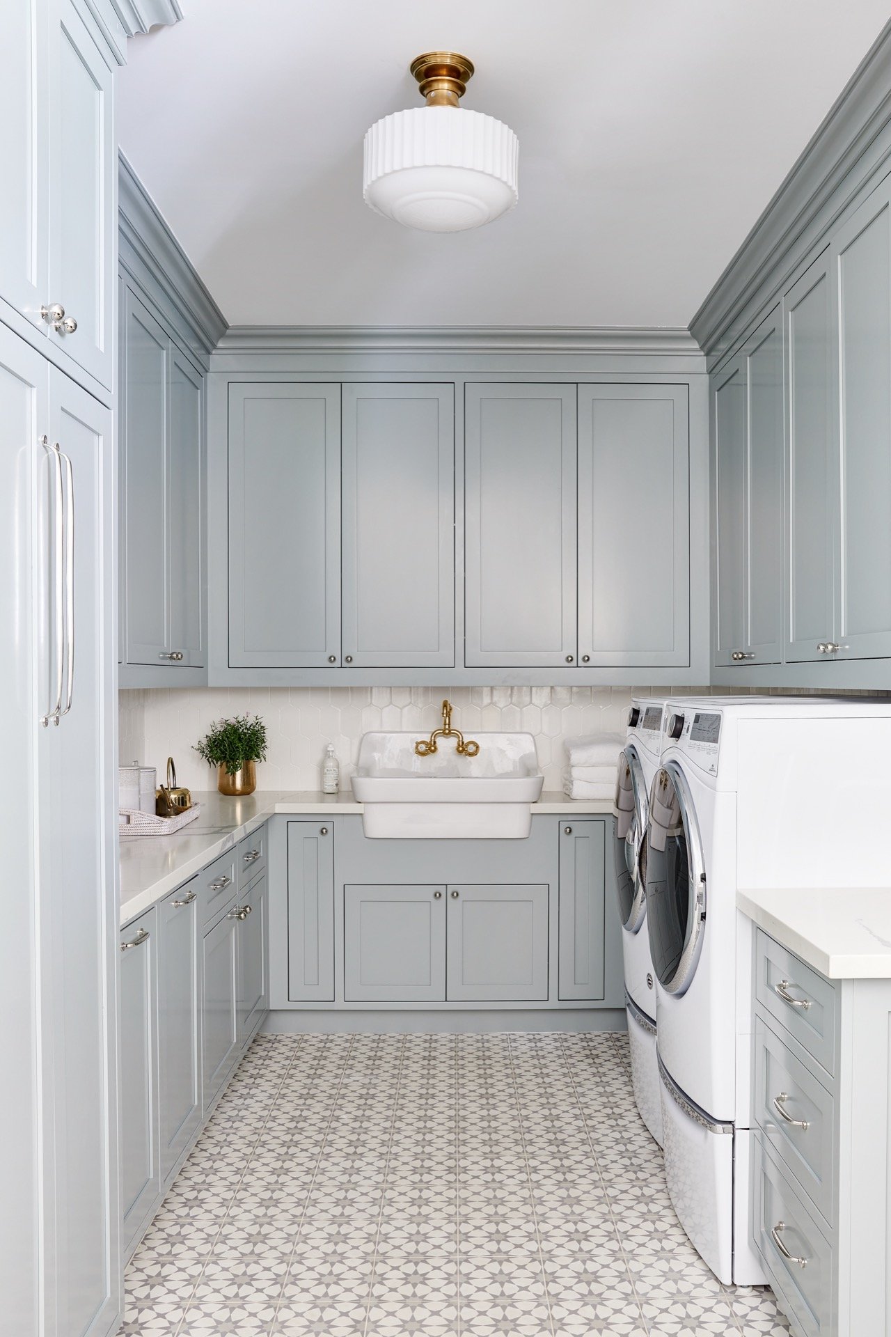
Our journey begins with Greyhound by Benjamin Moore, a color that's as versatile as it is captivating. Is it blue? Is it green? It's both! This chameleon of a color strikes the perfect balance between cool tones, making it a go-to choice for any space. Trust me, it's the ol' reliable of paint colors.


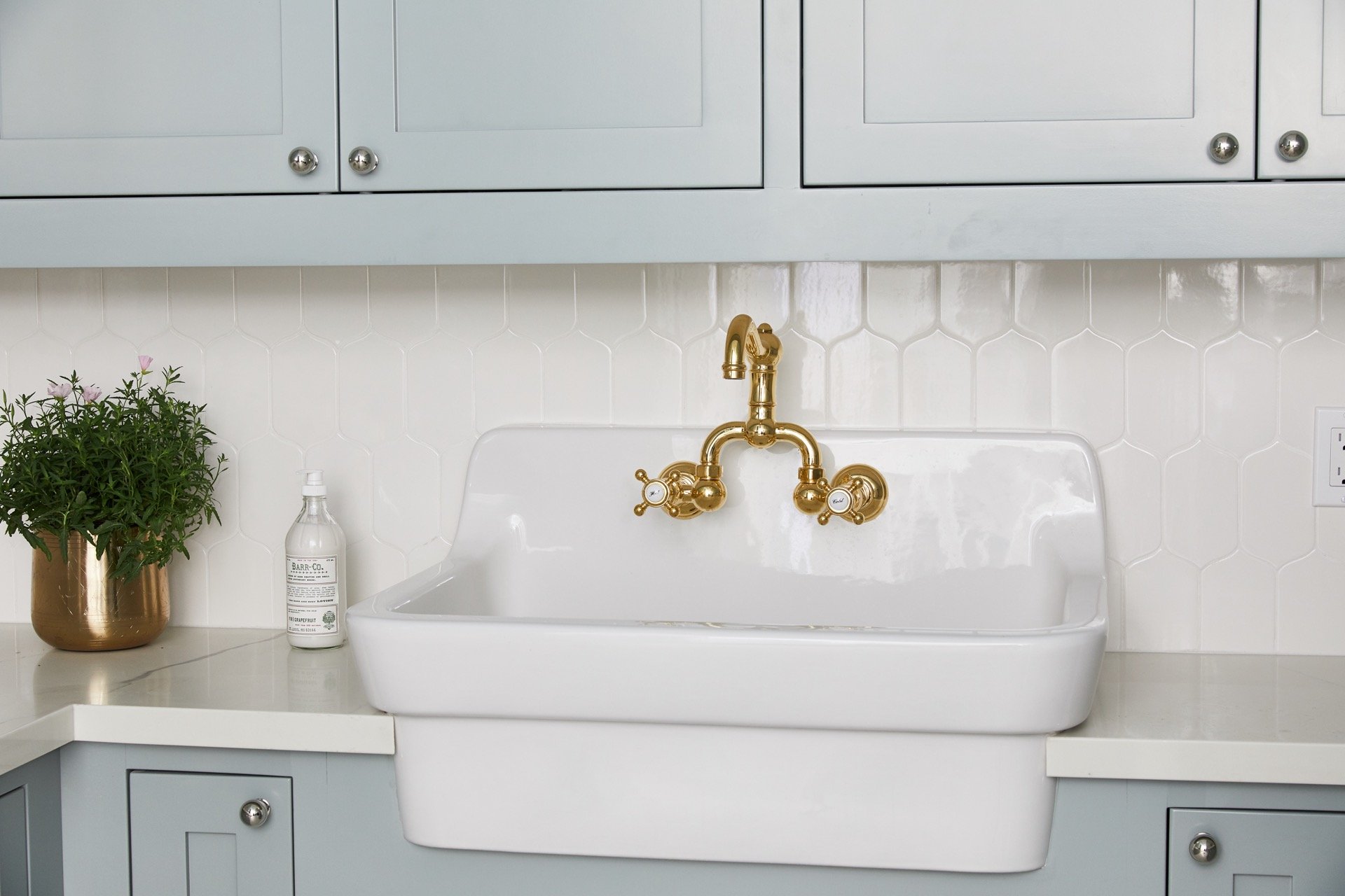
But Greyhound isn't just a color—it's a design essential. I love using Greyhound in laundry rooms like in our 51st Reno project because it's the perfect backdrop for creating a serene oasis. Whether it's paired with crisp white accents for a clean, modern look or rich wooden textures for a touch of warmth and depth, Greyhound always steals the show. It's the ultimate design secret weapon—a color that never fails to impress and always leaves a lasting impression.


So, what do you think—does Greyhound lean more towards green or blue? The debate rages on, but one thing's for sure: it's a color that's sure to spark conversation and captivate the imagination.


A cozy laundry room featuring grey cabinets, with washer and dryer appliances on the right, a farmhouse sink in the middle, and cabinets surrounding the space. The counter is white, complementing the grey and white patterned tile floor.

2. Cheating Heart by Benjamin Moore

Cheating Heart by BM isn't your typical black or navy blue—it's a luxurious fusion of the two. (Okay, accidental rhyme!) But seriously, picture a shade that's so much more than just a color; it's a statement, a bold declaration of style and sophistication.


I love using Cheating Heart in office spaces like our 51st Reno Office because it brings a sense of drama and elegance to the room. Stepping into the office, you're immediately struck by the richness of this hue—it's neither black nor blue, but something uniquely in between. It's the kind of color that commands attention and sets the tone for a space that's both opulent and inviting.


But here's the beauty of Cheating Heart—it's incredibly versatile. Pair it with metallic accents for a touch of glamour or opt for luxurious furnishings in plush fabrics to create a truly indulgent atmosphere. Whether you're going for a modern chic look or a more traditional aesthetic, Cheating Heart effortlessly elevates any space, adding a sense of luxury and sophistication that's simply unmatched.


So if you're ready to make a statement and infuse your space with a sense of luxury, look no further than Cheating Heart by BM. With its striking hue and undeniable elegance, it's sure to transform your room into a haven of opulence and style.


3. Shaded White by Farrow & Ball

When it comes to finding the perfect shade of white, the search can feel never-ending. But fear not! Shaded White by Farrow & Ball is my ultimate go-to. It's the epitome of perfection—a creamy hue with no pesky yellow undertones, striking the ideal balance between light and dark. Just take a peek at our DC Ranch Kitchen Cabinets to see this stunning shade in action!


Shaded White is more than just a color—it's the epitome of timeless elegance. Its creamy warmth infuses any space with a sense of sophistication and coziness. I love using Shaded White in kitchens like in our DC Ranch Kitchen Cabinets project because it effortlessly elevates the space to new heights of luxury. Whether it's paired with sleek marble countertops for a modern chic look or complemented by brass fixtures for a touch of vintage glamour, Shaded White always adds a touch of understated elegance.


So if you're searching for the perfect shade of white to bring a touch of luxury to your space, look no further than Shaded White by Farrow & Ball. With its creamy hue and timeless appeal, it's sure to create a kitchen that's both inviting and refined.


4. Down Pipe by Farrow & Ball

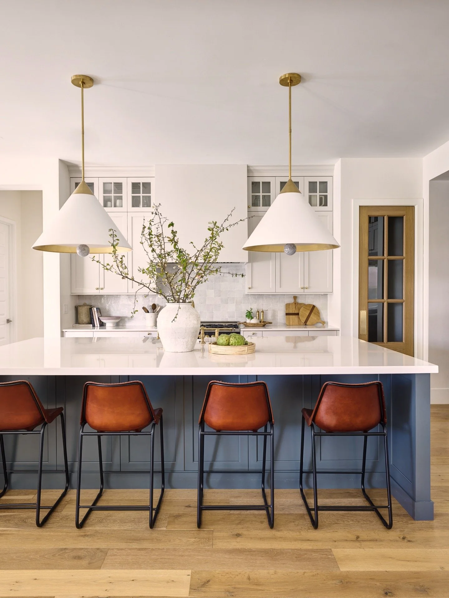
Looking to add a moody blue? Look no further than Down Pipe by Farrow & Ball. I used this paint color on my kitchen island, and let me tell you, I LOVE it. I also couldn't resist incorporating it into the design of the DC Ranch Butler’s Kitchen. It's the perfect shade of dark blue—just a hint of mystery and allure that sets it apart from your typical navy.


Down Pipe isn't just a paint color; it's an experience. Moody, mysterious, and utterly captivating, it adds an undeniable depth and character to any space it graces. Picture walking into a kitchen or butler’s pantry bathed in the rich hue of Down Pipe—immediately, you're drawn into its alluring embrace, like stepping into a scene from a classic film noir.


I adore using Down Pipe in kitchens and butler’s pantries like in our DC Ranch project because it effortlessly elevates the space to new heights of sophistication. Whether it's paired with sleek stainless steel appliances for a modern edge or complemented by rustic wooden accents for a touch of warmth, Down Pipe never fails to impress. It's the kind of color that commands attention and sparks conversation, making it a must-have for any design enthusiast.


So if you're ready to make a statement with your paint color, why not indulge in the moody allure of Down Pipe by Farrow & Ball? With its captivating hue and undeniable charm, it's sure to transform your space into a haven of elegance and intrigue.


A modern kitchen corner featuring gray cabinetry, a built-in wine fridge, and terracotta floor tiles, with natural light streaming in from two windows.

5. Pale Oak by Benjamin Moore

When it comes to adding a touch of contrast that really stands out, Pale Oak by BM is my top pick. This versatile hue works wonders on walls, cabinets, and trim, bringing an instant touch of elegance to any room. Just take a peek at our Fountain Hills Primary Bathroom—it's like a match made in design heaven!


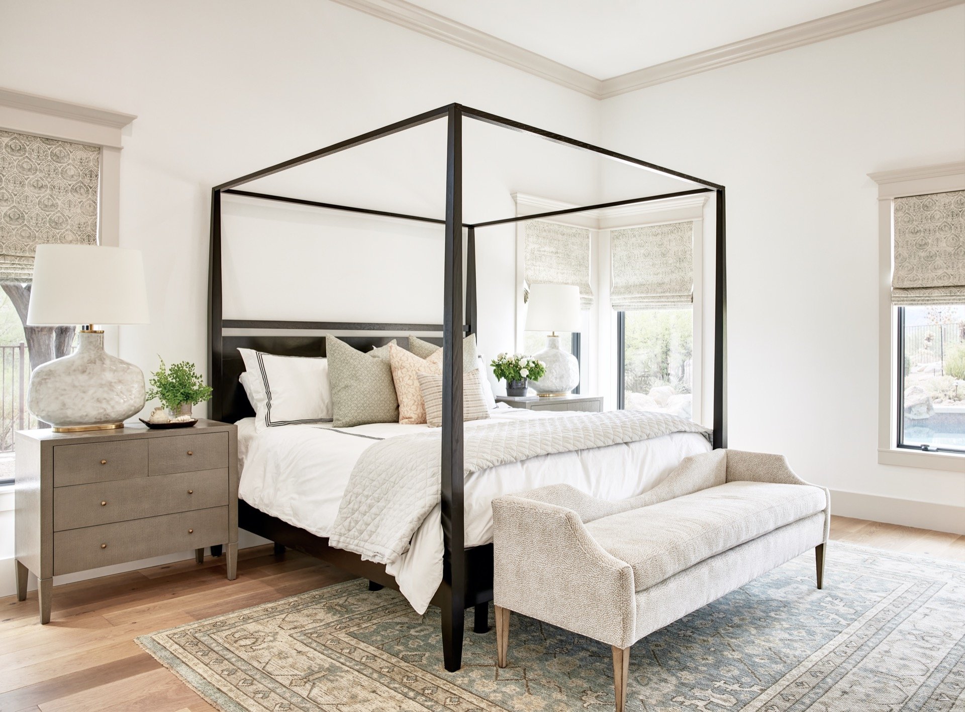
Pale Oak is all about subtlety with a punch. It's the kind of color that quietly commands attention, making it perfect for creating contrast in spaces like primary bedrooms and bathrooms. In our Fountain Hills project, we used Pale Oak as a contrasting trim color and it adds a layer of softness and sophistication that elevates the entire room. Whether it's paired with plush velvet textiles or sleek marble finishes, Pale Oak always brings a sense of luxury to the space.


So, if you're looking for a paint color that's both understated and striking, look no further than Pale Oak by BM. It's the secret ingredient that adds that extra touch of elegance to any design scheme.


6. Chantilly Lace by Benjamin Moore

Chantilly Lace by BM isn't just a white—it's the perfect shade for adding a touch of sophistication to any space. In the master bathroom of our Coeur d'Alene project, Chantilly Lace shines as the trim color, effortlessly complementing the surrounding elements and enhancing the overall aesthetic. Its clean and crisp appearance adds a layer of refinement without overpowering the space, creating a serene oasis that's both stylish and inviting.


And in the great room, Chantilly Lace takes on a new role as the color of the shiplap behind the console with the round mirror. Its bright and airy demeanor brings a sense of freshness to the room, while its subtle warmth prevents it from feeling too stark or clinical. The result? A space that feels both cozy and sophisticated, perfect for relaxing or entertaining with loved ones.


But what truly sets Chantilly Lace apart is its versatility. Whether it's used as trim, wall color, or even on shiplap, its timeless beauty shines through, making it a go-to choice for designers and homeowners alike. So if you're in search of the perfect white, look no further than Chantilly Lace by BM. With its pure elegance and effortless charm, it's sure to elevate any space to new heights of style and sophistication.


7. Alabaster by Sherwin Williams

Alabaster by Sherwin Williams is my top pick for walls that command attention. Its bright, warm, and inviting demeanor makes it an ideal choice for both office spaces and personal sanctuaries alike. With its subtle undertones, it strikes a delicate balance, offering just the right amount of contrast without overwhelming the space.


This is the exact paint color I selected for both our LWD office and my personal home! And let's not forget about the Fountain Hills living room—it's also adorned with the luxurious hue of Alabaster, creating a welcoming atmosphere that's both stylish and comforting.


Pairing Alabaster with Chantilly Lace by Benjamin Moore for trim creates a winning combination that's both timeless and chic. The clean, crisp look of Chantilly Lace beautifully complements Alabaster's warmth, adding depth and sophistication to any room. Together, they create a harmonious backdrop that sets the stage for elegant living.


And while the sample may appear deceptively white, once applied, Alabaster reveals its true colors—a creamy hue that exudes luxury and comfort. So if you're seeking to elevate your space with a touch of sophistication, look no further than Alabaster by Sherwin Williams.


8. Puritan Gray by Benjamin Moore

Last but not least, we have Puritan Gray by BM—the ultimate crowd-pleaser. From trim to cabinets to doors, this versatile hue does it all. It's hands down my favorite color, and once you see it in action, you'll understand why.


Does it ring a bell? It should. It's the iconic color of the Coeur d'Alene entryway, and for good reason. Puritan Gray is a true classic, versatile enough to enhance any space. Plus, it has a remarkable ability to transform its appearance depending on the lighting—just take a look at my comment section for evidence of this phenomenon. If you want to see how I use Puritan Gray in my projects, check this Instagram Reel I made.


I love using it on trim, cabinets, and doors like in our Coeur d'Alene project because it adds depth and character to the space. Whether it's paired with bold pops of color or soft neutral tones, Puritan Gray always brings a sense of sophistication to the space. I also use Puritan Gray on the cabinets in the iconic bathroom of our Fountain Hills project. Check out the pictures below to see it in action. I love how different this color looks in every space.


Conclusion

Wrapping up, these paint colors aren't just shades on a wall—they're the essential ingredients of interior design, the vibrant strokes that breathe life into every room. Whether you're in love with Greyhound for its chameleon-like charm, swooning over the boldness of Cheating Heart, or finding comfort in the warmth of Alabaster, each color brings its own flair to the table.


But hey, don't just take my word for it! I want to hear from you. Which of these hues speaks to your soul? Drop your favorite in the comments below and let's keep the paint party going. After all, the best designs are the ones that reflect who we are, so let's paint our world with a splash of personality and a whole lot of style!


So, as you embark on your next design adventure, remember the power of paint to transform not just spaces, but moods and moments. Let's celebrate the joy of design and the endless possibilities it brings. Together, let's create spaces that not only look good but feel like home. After all, life's too short for boring walls—let's make them sing with color and creativity!


Xoxo,


Lexi

Comments


join the conversation

follow along on Instagram

bottom of page