My Favorite White Paint Colors (and How We Actually Use Them)
White paint is the color people think is the safe choice, and it's actually one of the hardest decisions to make. Every white has an undertone (warm, cool, green, pink, gray), and that undertone shifts depending on the room's light, the flooring, the trim, and even the time of day. The wrong white doesn't look like a mistake. It just looks a little off, and most people can't say why.
Here are the whites I always reach for, and where each one earns its place.
Alabaster by Sherwin-Williams
Undertone: Warm
Where we use it: Walls, cabinetry, whole rooms
Alabaster is probably the white I use most. It's warm without being yellow, soft without being muddy. In a room with natural light, it feels clean and fresh. In a room with less light, it stays creamy rather than going gray on you, which is the thing most cool whites can't pull off.
See it on the walls in my kitchen.
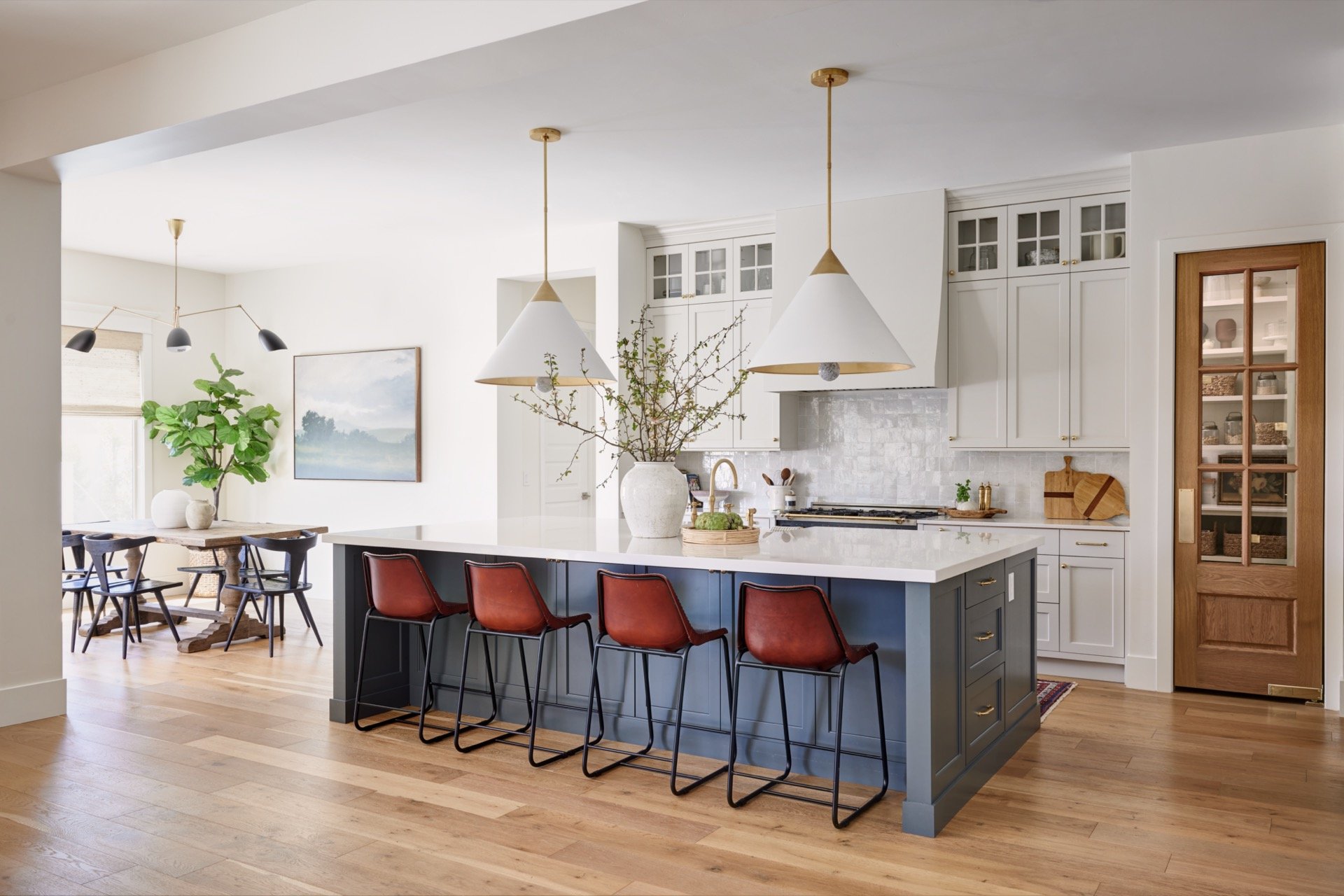
Milk Glass by Dunn Edwards
Undertone: Soft, clean white with a hint of warmth
Where we use it: Walls
Milk Glass is a softer alternative to a stark bright white, clean and fresh without the sharpness that some whites can have in certain lighting. It's the white that works when Chantilly Lace feels too crisp for the space. It sits in that sweet spot between warm and cool, which makes it incredibly versatile across different rooms and finishes. If you're in Arizona or the Southwest where Dunn Edwards is easy to access, this one is worth knowing about.
See it on the walls and trim at our Flagstaff Ranch Project.
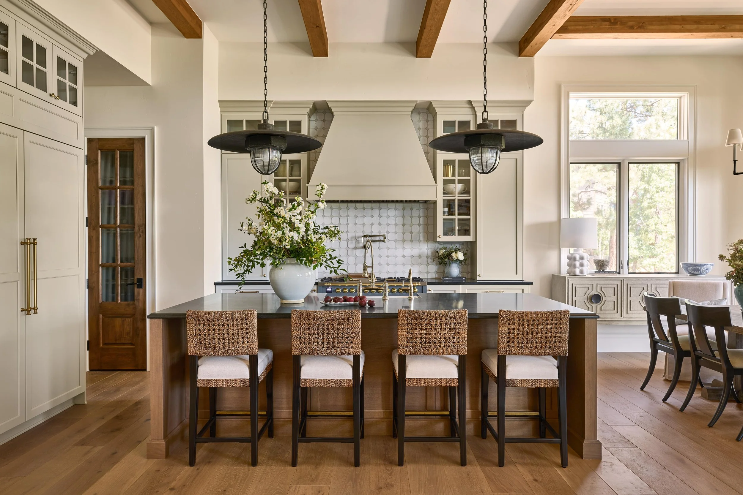
Swiss Coffee by Benjamin Moore
Undertone: Warm, soft cream
Where we use it: Walls, cabinetry, rooms that need warmth without going full color
Swiss Coffee is the white you reach for when Alabaster feels too bright for the space. It's a step warmer and softer — a creamy white that makes a room feel cozy and lived-in without tipping into yellow. We use it a lot on cabinetry when a client wants something warmer than a bright white but doesn't want to commit to a color. It also works beautifully on walls in rooms that don't get a ton of natural light, where it keeps things feeling warm rather than going flat.
See it on the walls at our Hermosa Groves Project.

Cloud White by Benjamin Moore
Undertone: Soft warm white, very slightly creamy
Where we use it: Walls + cabinetry
Cloud White is our go-to trim color more often than not. It's warm enough to work with other warm whites on the walls without fighting them, but bright enough to read as crisp and clean. The thing about trim is that you want it to feel intentional, not like you just used whatever was leftover, and Cloud White does that. It also works beautifully on cabinetry when a client wants something softer than a bright white but cleaner than a cream.
See it on the walls at our Coeur d’Alene Lake House.

Pale Oak by Benjamin Moore
Undertone: Warm, greige
Where we use it: Cabinetry
I know, I know. This isn’t technically a white, but it does read as a creamy white. Pale Oak is the one I reach for when a client wants the feeling of a white cabinet without the starkness of an actual white. It sits right on the line between white and warm greige because it's soft, layered, and livable. From a distance, it reads as white. Up close, it has just enough warmth to feel intentional. It's a great option for clients who are nervous about committing to color but don't want their home to feel cold or flat. It pairs beautifully with natural wood tones and warm finishes.
See it in our French Chateau laundry room.

A Final Note
None of these are a universal answer, even though people always want one. The right white is the one that's been tested against the materials in your home and the natural light. Not a swatch held up in a paint store under fluorescent bulbs.
Always sample on the wall. Live with it for a few days. Look at it in the morning, in the afternoon, and at night with the lights on. White changes more than any other color depending on the conditions around it, and the only way to know if you've got the right one is to see it where it actually has to live.
That's really the whole job with white: not picking a color, but picking it correctly for the room it has to live in.